Project services
Brand story
Brand personality
Brand identity platforms
Creative workshops
Personality guardrails
Storytelling principles
Agency partner
Design Bridge
Our brief
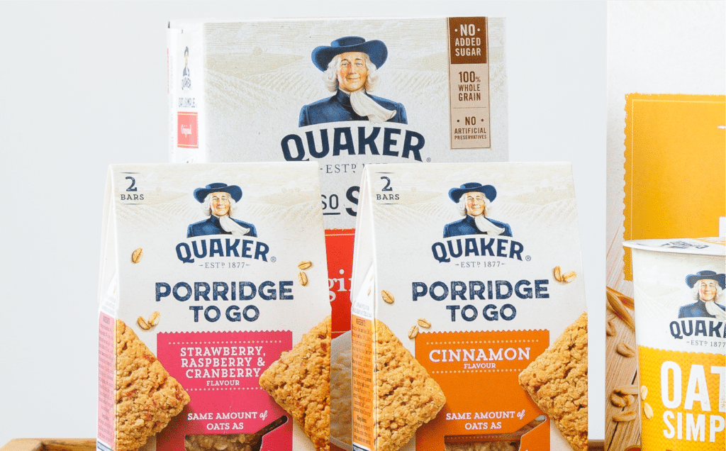
The Quaker team needed a new visual identity platform that would support global packaging harmonisation and inspire a new approach to communications and activation.
What we did
Brand story & personality
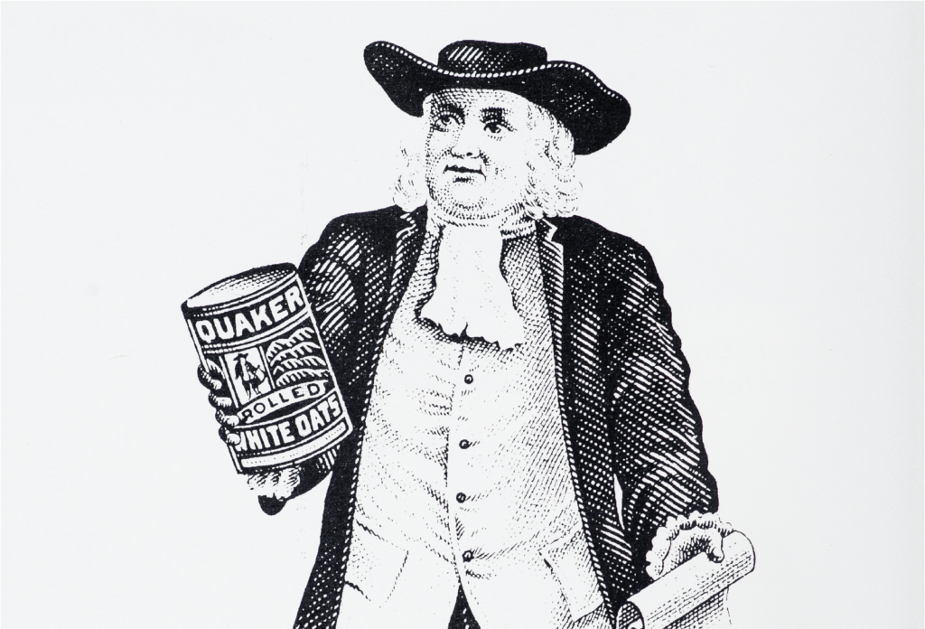
The existing visual equities of the brand were holding it back. The packaging codes were traditional and heavy, failing to play to emerging codes of natural nutrition. The stiff and formal portrait of the Quaker man made the brand feel distant and corporate.
Previous attempts to evolve the brand’s visual equities had been too conservative and incremental. Heritage was becoming a trap, not the asset it should have been.
Our approach was to shine a new light on brand heritage to re-engage creatives with the authentic potential of the brand story.

Storytelling principles
“I open the cupboard and see an old white guy staring down at me. It’s kinda scary to look at.”
This quote from a US consumer, captured during the global semiotic research that preceded our work, summed up the dilemma. The Quaker icon was a distinctive equity, but it wasn’t making the right emotional connections with consumers.
The design team within Pepsico were having the same problem. Even though they affectionately called the Quaker man “Larry”, they didn’t really know who he was, what he stood for or why he was on the pack.
This was a missed opportunity. This was a brand with a history to be proud of. A compelling origin story, a charismatic founder, an original purpose just as relevant today as ever, and a timeline studded with imaginative campaigns and pioneering innovations. These stories from the past were precious assets, but because no one was cultivating them, their value was ebbing away.
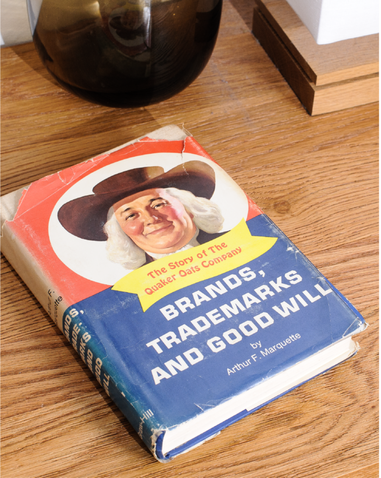
We dug deep into the brand’s history, scouring the archives, historical packaging and communications materials and several biographies of Henry Parsons Crowell, the charismatic founder of the business.
We brought the Pepsico brand and design team together in a two-day hothouse. We told the team 8 key stories about the Quaker brand, its products, people, innovations and contributions throughout the past 140 years. Through this story driven approach, we helped the Quaker team re-engage with the authentic roots of the brand and to connect it to the key themes that were driving consumer needs in the present day.

Brand identity & personality principles
We inspired Pepsico’s in house design team and their communication agencies by demonstrating that the true stories from the brand’s history were just as relevant as ever and could drive emotional connections.
We unleashed a wave of storytelling across the organisation and its partner agencies as everyone involved with the brand began to realise the potential of the brand’s truth.
These simple, true and nearly forgotten stories fuelled the definition of the Quaker brand personality and the creation of design principles which would guide all future design and communications work. Breathing fresh life into Quaker’s heritage.
Too often strategy falls off a cliff and fails to connect with visual expression. The end result is a plethora of abstract words, open to interpretation and a design team who views strategy as a source of complexity and lost project time. Building the bridge between strategy and expression was as critical to the Quaker project as any.
We translated our stories into three creative guiding principles which would direct the visual expression of the brand. Each of these captured one aspect of the brand’s personality in a set of visual codes, covering typography, colour, photography, material, structure and environments. These guiding principles were supported with other practical tools such as “is” & “is not” guardrails which together built a solid platform for future brand expression to be built upon.

Brand experience
One of the questions we asked in our hothouse was ‘What it would be like if Quaker created a pop-up high street brand experience. How would it tell the brand story, and bring their personality to life?’ This creative exercise soon turned into reality through the Quaker Oatery, a pop-up retail experience launched in Mexico City and Sao Paulo to coincide with the brand’s 140th year.
By quickly making the brand idea real, through a tangible and immersive experience, the Quaker design team demonstrated the potential of the brand to be an aspirational beacon for a healthy lifestyle and built momentum and belief in the new vision for the brand.
"

Pepsico


