For too long the menopause had been a taboo topic in society and the media. When business partners and nurse duo came to us needing a brand for their new menopause treatment clinic, we were all too ready to help shine the light on this sector and bring it to the forefront of people’s attention.
We needed to create a brand from scratch with a fresh yet human approach to cut through the sector and convey the personalised approach that the clinic offers.
What we did
Category & competitor analysis
First, we needed to understand the sector. We did a deep dive into the market to get to grips with everything from the symptoms and types of medication available, to the treatments currently on the market and the clinics offering them. We created a strategic market map to log and analyse our findings to present to our client. We detailed everything from treatments and products available to competitor clinic brand identities and language.
Trends & semiotics analysis
We analysed competitor brands in and close to our category, identifying market trends and semiotics. We recorded these on a positioning framework to lay out visually and spot the white space and help decide how our client should position themselves to stand out.
Mapping competitors on a positioning framework
Naming
The new brand now needed a name. After analysing the types of names already in the market, we pulled a team of heads together to come up with some fresh ideas. We wanted the consumer to understand the product and brand, have a contemporary feel, and echo the personalised, human approach offered by the clinic.
After compiling a shortlist we completed thorough trademark checks, domain name availability searches, and Google and social media checks.
The new name, ‘My Meno’, was a clear favourite with our client. Preferred for its personal feel through the possessive pronoun, the shortened ‘menopause’ adding a modern touch, the short and catchy nature of the full name, and its alliteration.
Now, we needed to bring it to life…
Positioning
We picked our clients’ brains to understand some of the personality characteristics they wanted their brand to reflect. For brands to succeed, it is paramount to build them based on real truths and beliefs. That’s why we always into the heads of the people behind them.
With a handful of strong adjectives, we set about carving My Meno’s personality to position it in the market in a way that cut through the rest and reached its consumer. We needed the brand to be believable, trustworthy, compassionate, and warm.
Communication
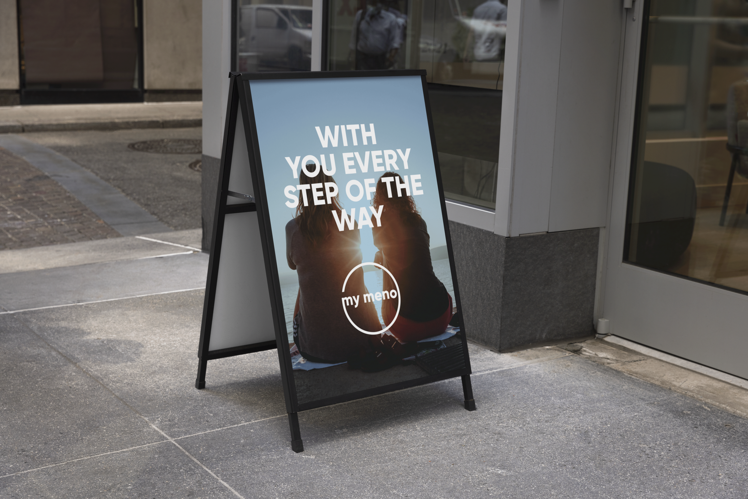
Having decided the brand’s positioning, we needed a communication platform around which we could create its brand world. We worked with our client to understand the main motivation behind the clinic and put it into words. My Meno existed to help its clients: ‘get back to feeling you again’.
From this purpose statement, we created a brand narrative, including a value proposition and mission. The language was aimed at reaching the consumer in a personal way, mirroring the clinic’s approach to menopause treatment.
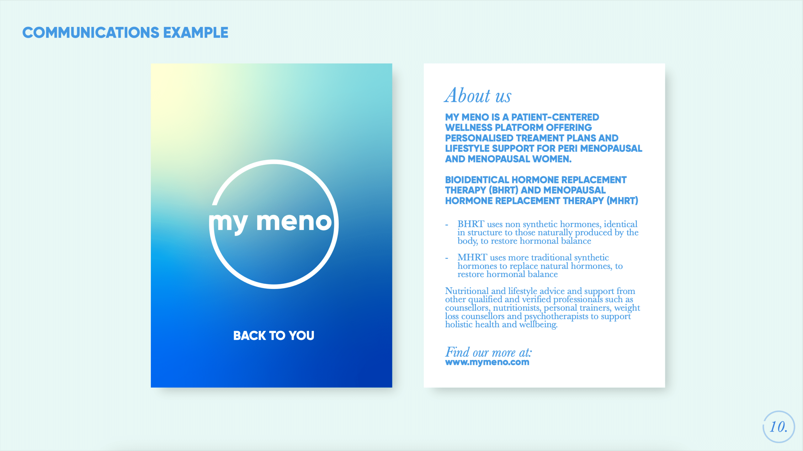
Visual Identity
Our research into market trends in visual identity and semiotics helped us pick the white space for My Meno. Competitor brands felt overly female, pink, wishy washy and generic. We felt a lot of them were variations of each other, with similar colour palettes, illustration styles, language and imagery. Nothing particularly stood out.
Being in the health sector, we wanted the brand to have a professional look and feel, yet at the same time be contemporary, warm and exciting.
We designed 12 different design options, based around four territory concepts: Full Colour; Balance; Full Circle; and Spark. These four guiding territories were mediums through which ‘menopause’ and ‘female health’ could be communicated in an exciting and new way.
Once our client had decided on a preferred design route (after some deliberation!), we developed it across multiple brand assets and implementations.
We packaged the new visual identity into a style guide and mini toolkit.
Copywriting & branded assets
Finally, we wrote and crafted the copy for the website, and went one step further in helping implement the new identity for the website too, producing a series of mock ups.
We also worked with our client to produce a 14 page branded Investor Deck, and lengthy business plan.
Equipped with a new brand and multiple assets, our clients could now launch it to the world on their mission to make the menopause a reality without stigma, and one that should be faced without fear!
"
It was a delight to work on bringing such a meaningful project to life and uncover so much about this pertinent issue, especially alongside clients who really believed in its purpose and the impact we could make together.
We use cookies on our website to give you the most relevant experience by remembering your preferences and repeat visits. By clicking “Accept All”, you consent to the use of ALL the cookies. However, you may visit "Cookie Settings" to provide a controlled consent.
This website uses cookies to improve your experience while you navigate through the website. Out of these, the cookies that are categorized as necessary are stored on your browser as they are essential for the working of basic functionalities of the website. We also use third-party cookies that help us analyze and understand how you use this website. These cookies will be stored in your browser only with your consent. You also have the option to opt-out of these cookies. But opting out of some of these cookies may affect your browsing experience.
Necessary cookies are absolutely essential for the website to function properly. These cookies ensure basic functionalities and security features of the website, anonymously.
Cookie
Duration
Description
cookielawinfo-checkbox-advertisement
1 year
The cookie is set by GDPR cookie consent to record the user consent for the cookies in the category "Advertisement".
cookielawinfo-checkbox-analytics
11 months
This cookie is set by GDPR Cookie Consent plugin. The cookie is used to store the user consent for the cookies in the category "Analytics".
cookielawinfo-checkbox-functional
11 months
The cookie is set by GDPR cookie consent to record the user consent for the cookies in the category "Functional".
cookielawinfo-checkbox-necessary
11 months
This cookie is set by GDPR Cookie Consent plugin. The cookies is used to store the user consent for the cookies in the category "Necessary".
cookielawinfo-checkbox-others
11 months
This cookie is set by GDPR Cookie Consent plugin. The cookie is used to store the user consent for the cookies in the category "Other.
cookielawinfo-checkbox-performance
11 months
This cookie is set by GDPR Cookie Consent plugin. The cookie is used to store the user consent for the cookies in the category "Performance".
viewed_cookie_policy
11 months
The cookie is set by the GDPR Cookie Consent plugin and is used to store whether or not user has consented to the use of cookies. It does not store any personal data.
Functional cookies help to perform certain functionalities like sharing the content of the website on social media platforms, collect feedbacks, and other third-party features.
Performance cookies are used to understand and analyze the key performance indexes of the website which helps in delivering a better user experience for the visitors.
Analytical cookies are used to understand how visitors interact with the website. These cookies help provide information on metrics the number of visitors, bounce rate, traffic source, etc.
Cookie
Duration
Description
_ga
2 years
This cookie is installed by Google Analytics. The cookie is used to calculate visitor, session, campaign data and keep track of site usage for the site's analytics report. The cookies store information anonymously and assign a randomly generated number to identify unique visitors.
_gat_gtag_UA_197848720_1
1 minute
This cookie is set by Google and is used to distinguish users.
_gid
1 day
This cookie is installed by Google Analytics. The cookie is used to store information of how visitors use a website and helps in creating an analytics report of how the website is doing. The data collected including the number visitors, the source where they have come from, and the pages visted in an anonymous form.
Advertisement cookies are used to provide visitors with relevant ads and marketing campaigns. These cookies track visitors across websites and collect information to provide customized ads.